
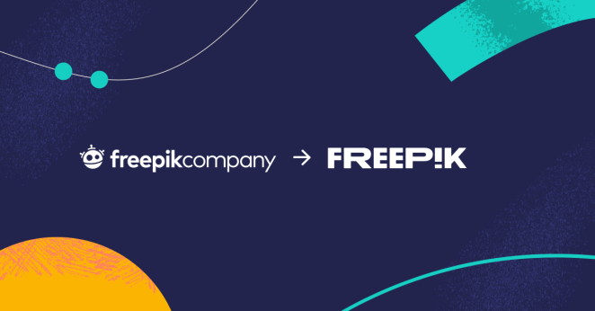
This summer, San Francisco-based creative agency Partners in Crime worked with Freepik (previously Freepik Company) to evolve the name, logo, tone of voice, colour palette, typography, iconography for the image bank website. To learn more, we spoke to Stephen Goldblatt, Founder and CD at Partners in Crime.
What was the brief for the rebrand?
We were asked to create a clear brand narrative for Freepik. This narrative would serve as the brief both for Freepik’s entry into the US market, as well as a strategic blueprint for a more clarified, cohesive global brand. Freepik is a leading global tech company that helps anyone create great designs faster by producing and distributing high-quality graphic and audiovisual resources.
The company had kind of “grown up” over the last few years, and their existing brand identity was like a set of clothes that they needed to trade in for one that better expressed its exponential growth, bold ambitions and AI innovation.
How did the initial pitch/brainstorming phase go?
We flew out to Malaga and spent a week with the client — getting a better understanding of their culture and working with the founders and senior leadership to articulate their vision. It was a deep dive into their world, and it opened our eyes to the founders’ commitment to helping people everywhere express themselves creatively.
Describe the purpose of the brand and its target audience
Freepik is a valued resource for designers around the world but wasn’t getting the credit it deserved for the role it played in creating and providing easy and accessible design tools and resources to designers. Unlike many of their competitors, they provide a much more affordable, and open, platform for designers and others who are looking to express their creative voice.
The goal for Freepik was to always empower users. Whether you’re a business, designer, personal brand, teacher, or anything else, you deserve access to tools and resources that will turn ideas into reality without, say, needing the skills to use Adobe Creative Suite, or the budget for an expensive subscription.
Over the past decade, the breadth and quality of Freepik’s offering has been supercharged, and as a result has seen incredible growth, reaching over 100 million global users and launching its AI text-to-image generator which has seen over 1.5 million images generated already. This success necessitated a bolder, bigger brand, which also showed commitment to their roots, so that’s what we did.
What was your thinking behind the rebranding solution?
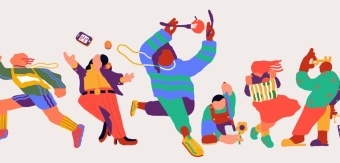
The heart and soul of the rebranded Freepik was to highlight how having so many powerful, quality tools and assets at your disposal can amplify your creative output and supercharge your idea generating skills. That's why we designed a new brand identity that is energetic, playful and bold.
Did you learn anything new during the project?
Working with the in-house creative team at Freepik was definitely a fruitful learning experience. Since they are rooted in Spain, our working style had to adjust not only to the time difference, but also the cultural differences between American and European design sensibilities. In the end, we're really happy with the result which could not have been achieved had we not had the benefit of collaboration.
What was the biggest challenge? How did you overcome it?
The biggest challenge was having to accommodate the desires of multiple stakeholders, not all of whom were present for the duration of the project. But as stated above, we found a groove and ended up with a design system everyone can be proud of.
What kit/tools/software were used to create it?
For the Freepik rebrand we used a combination of the Adobe Creative Suite, Figma and — of course — plenty of assets from Freepik.
What details are you most proud of and why?
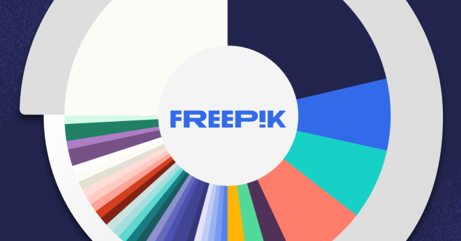
It all starts with the new logotype. We love how expressive it is, without being over-designed. There's flexibility, strength and the euphoric moment a creative spark ignites, all baked in it. We also are excited about the new truncated mark, which stacks FRPK.
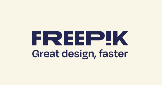
It's a visual shorthand for the brand, and will be really fun to see how it appears on swag. The Degular typeface is another highlight for us. It's rooted in classic typographic forms but has just enough nuance and added detail to carve out its own distinct, contemporary personality. Perfect for Freepik.
What visual influences fueled your solution?
This is a tough question to answer. As creatives, we act as inspiration sponges every time we fire up our Macs or step out into the world. There's just so much amazing design happening these days, to pull inspiration from without plagiarising. Specific name drops that were influential during this project could be Collins, Porto Rocha, Studio Dumbar, Christopher Doyle & Co and &Walsh.
What do you hope it achieves for the brand?
We always approach identity projects to be evergreen solutions that our clients can live in and grow with for many years to come. The sweet spot is when we arrive at a brand identity (not just the logo!) that feels timeless, but also flexible enough to breathe. To evolve over time just enough to build recognition and love in the consumer's eye, and still keep things fresh and alive.
What would you do differently if you could do it over again?
To be honest, the project went fairly as planned. That said, I think if we were to do this again, we would plan to spend multiple weeks with the client in-person in Malaga. Being there to share variations and certain nuances of colour, type and how it all works together as well as making key decisions face to face would have sped up the process and allowed all decision makers to feel the moment a decision was being made.
When approvals are done over Zoom or email, there isn’t that finality needed sometimes to act as chapters of the process. Additionally, Malaga is a gorgeous and historic city and spending time there is inspiring and just fun.
Credit list for the work?
Partners in Crime, Creative Agency
Stephen Goldblatt, Founder and CD
Harlan Kennedy, Strategy Director
Cris Logan, Design Director